Free Domestic Ground Shipping on Orders $250+

Ask the Expert: Party Tips with Chris Hessney

Ask the Expert: Party Tips with Chris Hessney

Chris is the founder, president, and creative director of Hessney & Co., an international event production and design agency based out of New York City. With a strong background in event management and design as well as a commitment to a personalized approach, Chris has worked with such notable NYC entertainment giants as restaurateur Stephen Starr, Chef Morimoto, and Andrew Balazs, and he was an integral part of the opening team at The Standard Highline. After serving as the Corporate Style director of EMM Group, Chris extended his brand collaborations to include Armani, Goop, Netflix, and Martha Stewart Weddings, and in 2020 he was recognized by Harper’s Bazaar Magazine as one of the top wedding florists in the world. Chris’ impeccable eye for design and attention to detail put him in a class by himself, making Hessney & Co. synonymous with excellence on the event planning stage. Visit https://hessneyandco.com/ for more information about Chris’s work. 

Von Gern Home: How are you celebrating July Fourth?
Chris Hessney: My husband, our dog, and I are going up to Vermont to visit my sister and her kids.

VGH: What is your ideal summer dinner party setting?
Chris: Ideally, I would be dining al fresco every night in the Italian countryside surrounded by candlelight.

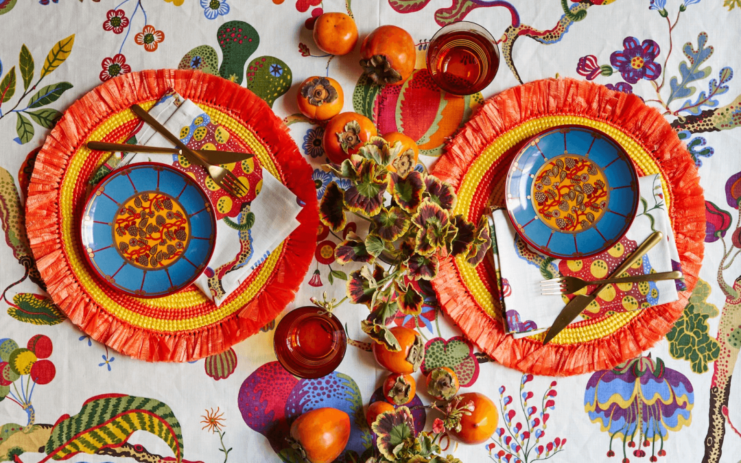
VGH: What is on your table?
Chris: On my table right now are Paravicini plates, Sabre flatware, Baccarat glasses, Sferra linens, and Von Gern Home placemats.

VGH: What is on your summer dinner menu?
Chris: Summer for me is Italian and all about what’s in season. Heirloom tomatoes, fruits, an array of meats or cheeses. Cook what’s fresh and good.

VGH: Describe your aesthetic in five words or less.
Chris: Priceless and timeless.

VGH: Give us three tips for setting the perfect table.
Chris: Have fun with it, embrace the space you’re working with, and make it make sense.
Extra tip, a good tablescape is all about layering.

VGH: What is on your dinner party playlist ?
Chris: For a bigger dinner party, I prefer a more upbeat vibe. Artists like Balearic Beats or Hôtel Costes are always on my cocktail hour playlist. I’m also really into Lil Nas X right now.

VGH: What tabletop element should one never go without?
Chris: A table can never have too many flowers.

VGH: What is your signature dinner party cocktail?
Chris: My favorite go-to is batching a great margarita with Casa Dragones. Nothing like tequila to get the party started.

VGH: Name three ingredients of a successful party.
Chris: Good lighting, good music, and a tantalizing tablescape.

VGH: Dream dinner party venue?
Chris: Villa Astor on the Amalfi Coast in Italy.

VGH: Go-to hostess gift?
Chris: Von Gern Home lacquer tray set with your favorite bottle of alcohol.

VGH: What is one item you would never entertain without?
Chris: Never go without candle light.

VGH: What projects are you currently working on?
Chris: We’re working on some very exciting things but unfortunately we can’t say.

VGH: Who would you invite to your dream dinner – dead or alive?
Chris: Salvador Dali.

read more
Fall Fun

Fall Fun

FUN WITH FESTIVE FALL COLORS


Styled By is a section that celebrates creativity and inspiration in the home. Our goal is to show you how to style a variety of Von Gern Home products and open your mind to a wealth of table setting ideas for everyday use in your own home.


This month, we’re having fun with festive Fall colors. We’ve styled a table two ways: one a celebratory, colorful brunch and one a simple, graphic lunch setting. The common denominator? This season’s most popular color.

Sure, orange for fall might not seem like a groundbreaking concept, but hear us out: The de-facto color of autumn doesn’t have to conjure images of pumpkins and crunchy leaves. Which is why we’ve spun not one but two new takes on the hue for your autumnal entertaining.

FESTIVE SUNDAY BRUNCH

 
Looking for something a bit more festive? Take a cue from design icon Josef Frank and festoon your table with an array of jewel tones. When you’re using bold, saturated colors, more is more—don’t worry about matching or clashing. For added texture, look to natural elements, like the raffia fringe on these round placemats and centerpieces of colorful fruits, like ripe persimmons.
 
Whether you’re celebrating a special occasion or just want to dress up an everyday meal, tabletop is the perfect way to do that.


Now, more than ever, it’s important to elevate the everyday. When you’re at home, there’s no reason every meal can’t be a chance to show your style.

A GRAPHIC LUNCH SCENE

 
As the days at home drone on, there’s no better reason to lay out a punchy table setting to inject a bit of spirit. And that doesn’t have to mean breaking out the entire wedding china service: Try selecting just a couple elements in coordinating bold colors for the most simple statement.

As for perfect coordination? Overrated. Instead of striving for perfect matches, pair tabletop items in similar color families but different hues and patterns for a look that’s fun, unique, and visually stimulating. Here, two versions of stripe pop against the printed tablecloth. A simple, linen napkin serves as a grounding neutral. And voilà: Lunch—and style—is served.
 

We like mixing the unexpected — go for coordinating over precise matching.

FUN WITH FESTIVE FALL COLORS


Styled By is a section that celebrates creativity and inspiration in the home. Our goal is to show you how to style a variety of Von Gern Home products and open your mind to a wealth of table setting ideas for everyday use in your own home.


This month, we’re having fun with festive Fall colors. We’ve styled a table two ways: one a celebratory, colorful brunch and one a simple, graphic lunch setting. The common denominator? This season’s most popular color.

Sure, orange for fall might not seem like a groundbreaking concept, but hear us out: The de-facto color of autumn doesn’t have to conjure images of pumpkins and crunchy leaves. Which is why we’ve spun not one but two new takes on the hue for your autumnal entertaining.

FESTIVE SUNDAY BRUNCH


Looking for something a bit more festive? Take a cue from design icon Josef Frank and festoon your table with an array of jewel tones. When you’re using bold, saturated colors, more is more—don’t worry about matching or clashing. For added texture, look to natural elements, like the raffia fringe on these round placemats and centerpieces of colorful fruits, like ripe persimmons.

Whether you’re celebrating a special occasion or just want to dress up an everyday meal, tabletop is the perfect way to do that.


Now, more than ever, it’s important to elevate the everyday. When you’re at home, there’s no reason every meal can’t be a chance to show your style.”

A GRAPHIC LUNCH SCENE


As the days at home drone on, there’s no better reason to lay out a punchy table setting to inject a bit of spirit. And that doesn’t have to mean breaking out the entire wedding china service: Try selecting just a couple elements in coordinating bold colors for the most simple statement.

As for perfect coordination? Overrated. Instead of striving for perfect matches, pair tabletop items in similar color families but different hues and patterns for a look that’s fun, unique, and visually stimulating. Here, two versions of stripe pop against the printed tablecloth. A simple, linen napkin serves as a grounding neutral. And voilà: Lunch—and style—is served.


We like mixing the unexpected — go for coordinating over precise matching.

Shop this style …

Woven Fringe Coasters, Set of 4

Original price was: $60.00.Current price is: $44.00.

Lacquer Tray – Orange

$150.00$250.00

Lacquer Tray – Orange

$150.00$250.00

Lacquer Tray – Orange

$150.00$250.00

Lacquer Tray – Orange

$150.00$250.00

read more