FUN WITH FESTIVE FALL COLORS
Styled By is a section that celebrates creativity and inspiration in the home. Our goal is to show you how to style a variety of Von Gern Home products and open your mind to a wealth of table setting ideas for everyday use in your own home.
This month, we’re having fun with festive Fall colors. We’ve styled a table two ways: one a celebratory, colorful brunch and one a simple, graphic lunch setting. The common denominator? This season’s most popular color.
Sure, orange for fall might not seem like a groundbreaking concept, but hear us out: The de-facto color of autumn doesn’t have to conjure images of pumpkins and crunchy leaves. Which is why we’ve spun not one but two new takes on the hue for your autumnal entertaining.
FESTIVE SUNDAY BRUNCH
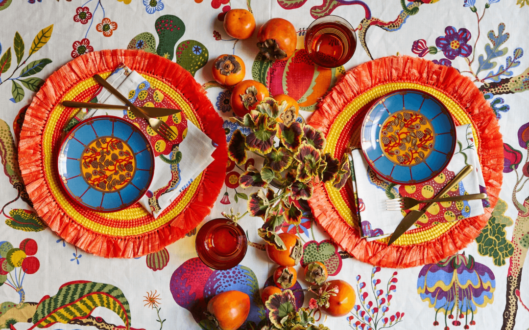
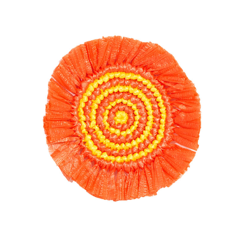
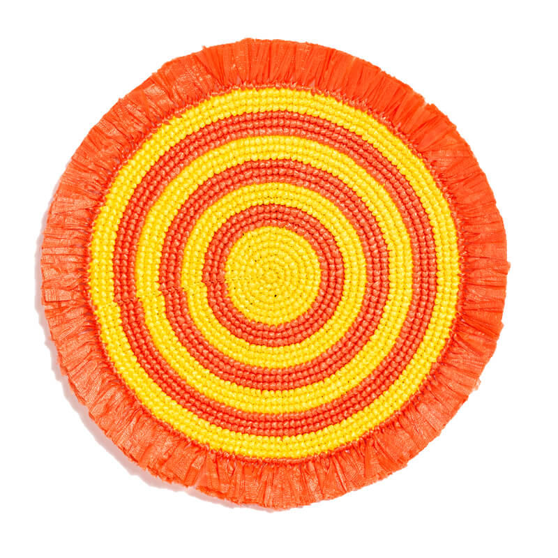
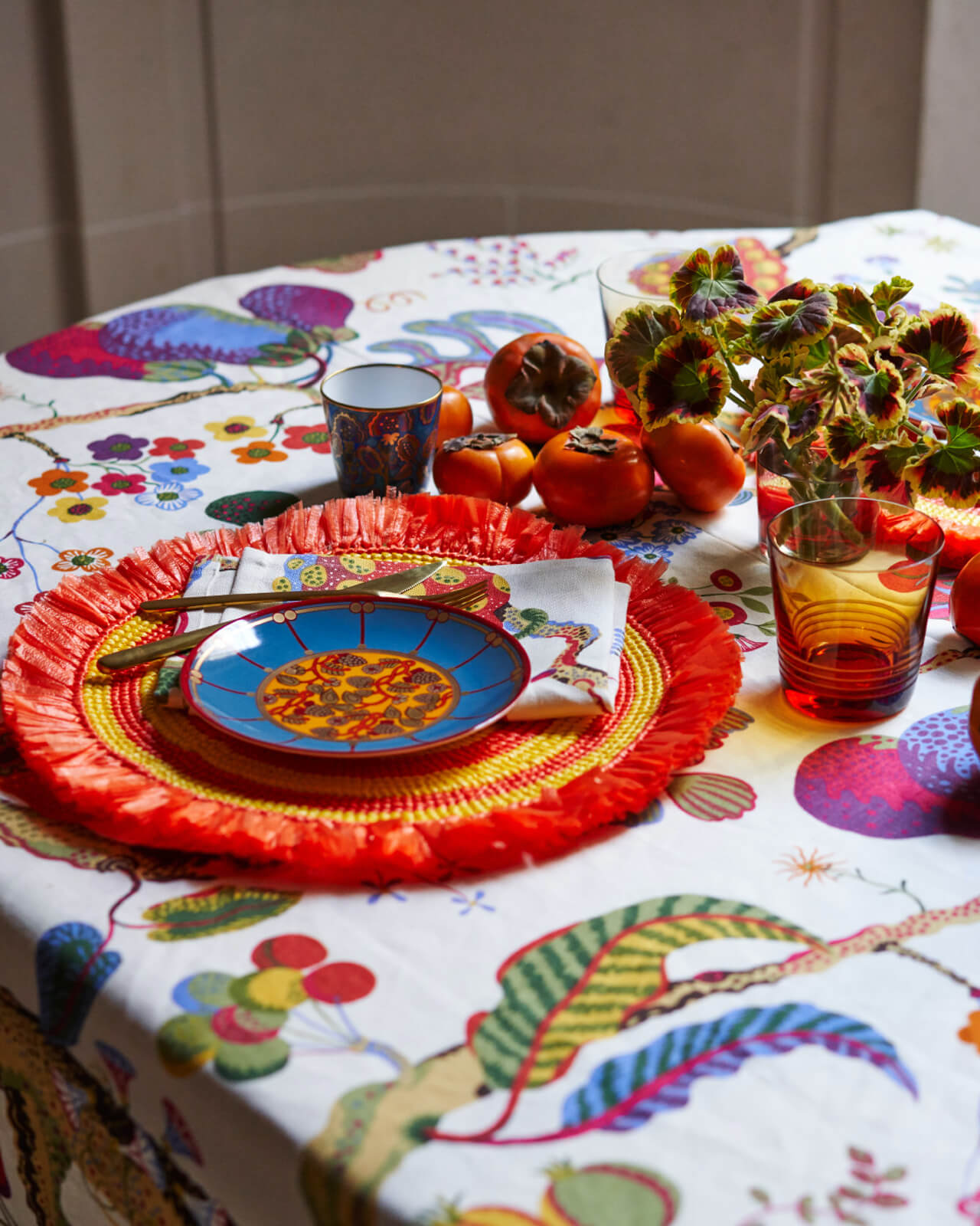
Looking for something a bit more festive? Take a cue from design icon Josef Frank and festoon your table with an array of jewel tones. When you’re using bold, saturated colors, more is more—don’t worry about matching or clashing. For added texture, look to natural elements, like the raffia fringe on these round placemats and centerpieces of colorful fruits, like ripe persimmons.
Whether you’re celebrating a special occasion or just want to dress up an everyday meal, tabletop is the perfect way to do that.
Now, more than ever, it’s important to elevate the everyday. When you’re at home, there’s no reason every meal can’t be a chance to show your style.
A GRAPHIC LUNCH SCENE
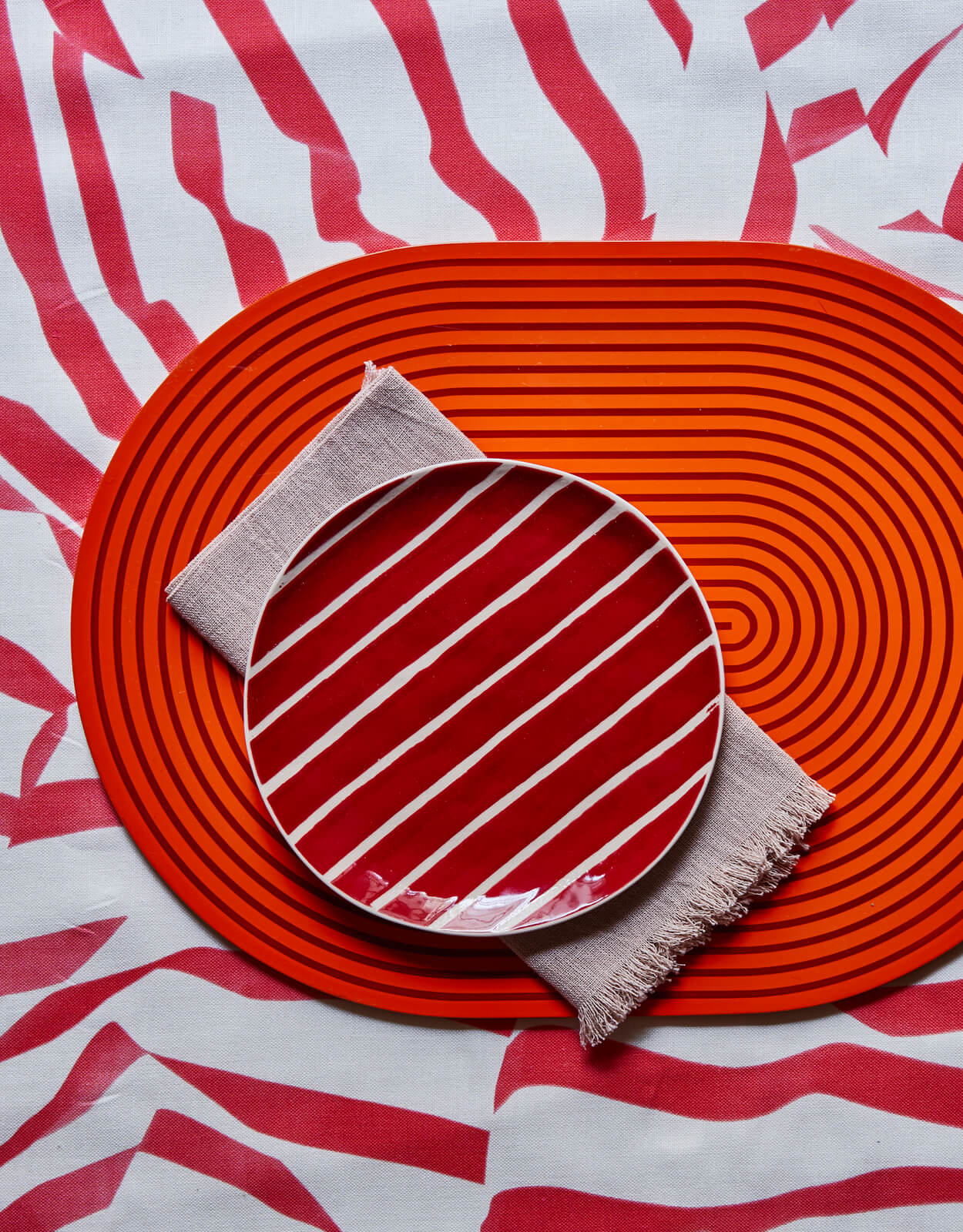
As the days at home drone on, there’s no better reason to lay out a punchy table setting to inject a bit of spirit. And that doesn’t have to mean breaking out the entire wedding china service: Try selecting just a couple elements in coordinating bold colors for the most simple statement.
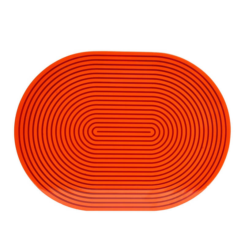
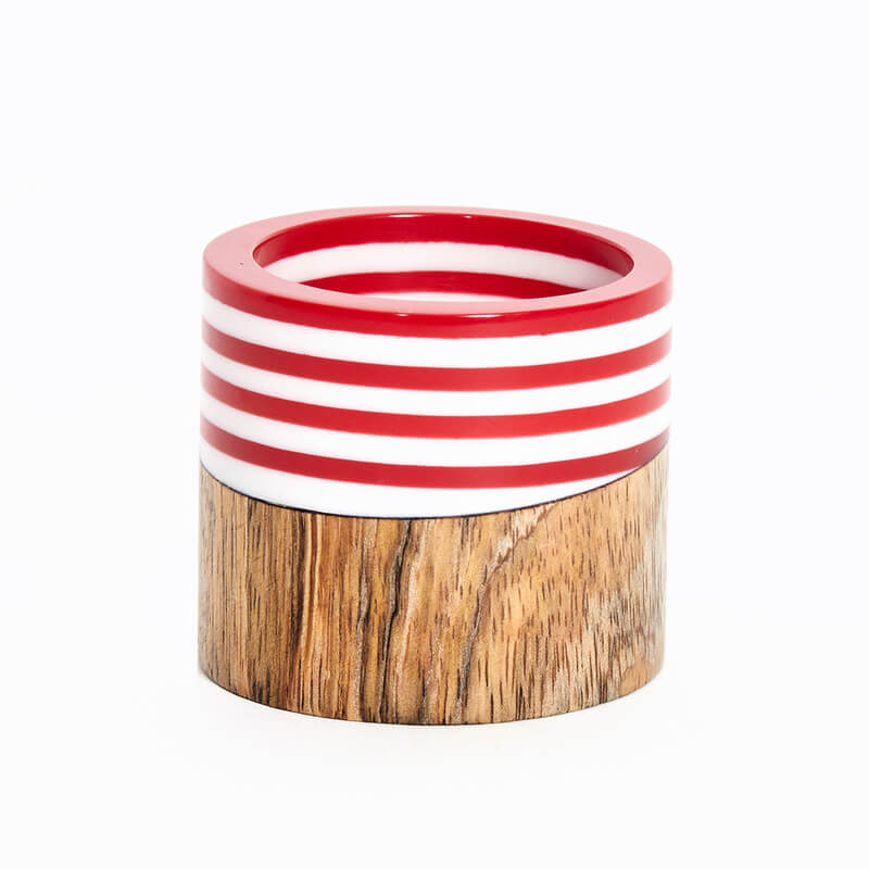
As for perfect coordination? Overrated. Instead of striving for perfect matches, pair tabletop items in similar color families but different hues and patterns for a look that’s fun, unique, and visually stimulating. Here, two versions of stripe pop against the printed tablecloth. A simple, linen napkin serves as a grounding neutral. And voilà: Lunch—and style—is served.
We like mixing the unexpected — go for coordinating over precise matching.

FUN WITH FESTIVE FALL COLORS
Styled By is a section that celebrates creativity and inspiration in the home. Our goal is to show you how to style a variety of Von Gern Home products and open your mind to a wealth of table setting ideas for everyday use in your own home.
This month, we’re having fun with festive Fall colors. We’ve styled a table two ways: one a celebratory, colorful brunch and one a simple, graphic lunch setting. The common denominator? This season’s most popular color.
Sure, orange for fall might not seem like a groundbreaking concept, but hear us out: The de-facto color of autumn doesn’t have to conjure images of pumpkins and crunchy leaves. Which is why we’ve spun not one but two new takes on the hue for your autumnal entertaining.
FESTIVE SUNDAY BRUNCH
Looking for something a bit more festive? Take a cue from design icon Josef Frank and festoon your table with an array of jewel tones. When you’re using bold, saturated colors, more is more—don’t worry about matching or clashing. For added texture, look to natural elements, like the raffia fringe on these round placemats and centerpieces of colorful fruits, like ripe persimmons.
Whether you’re celebrating a special occasion or just want to dress up an everyday meal, tabletop is the perfect way to do that.
Now, more than ever, it’s important to elevate the everyday. When you’re at home, there’s no reason every meal can’t be a chance to show your style.”

A GRAPHIC LUNCH SCENE
As the days at home drone on, there’s no better reason to lay out a punchy table setting to inject a bit of spirit. And that doesn’t have to mean breaking out the entire wedding china service: Try selecting just a couple elements in coordinating bold colors for the most simple statement.
As for perfect coordination? Overrated. Instead of striving for perfect matches, pair tabletop items in similar color families but different hues and patterns for a look that’s fun, unique, and visually stimulating. Here, two versions of stripe pop against the printed tablecloth. A simple, linen napkin serves as a grounding neutral. And voilà: Lunch—and style—is served.
We like mixing the unexpected — go for coordinating over precise matching.
