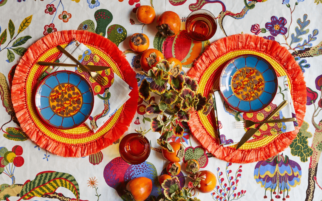
Christmas Table Setting Three Ways
There’s a Christmas table setting style for everyone—no matter the size of your gathering. Here’s how to get three looks.
With Thanksgiving behind us, there’s less than a month until Christmas. That means we’re approaching our favorite part of the holiday season: Setting the table. Although this Christmas might be different than in seasons past (we’re all for virtual celebrations and intimate gatherings), there’s no reason to overlook your Christmas table setting. In fact, we’d argue now is a better time than ever to celebrate the simple things. Your Christmas table setting is a great place to start. While thoughts of Christmas decor might conjure images of red and green tartan or candy cane stripes, the truth is there’s no one way to decorate for the season. Like all decor, it’s all about what you like—meaning the best table settings are the most personal. Looking for some inspiration to get you started? We’ve laid out three different styles, and outlined the items you’ll need to get each look. Consider these your jumping-off points, whether you want to completely recreate the look, or combine elements from one (or all three!) with your own style. Remember, at Von Gern Home we believe there’s no wrong way to set the table. Happy holidays! Cancelled festivities and virtual holiday meals may be putting a damper on your creative table setting efforts. But we’d encourage you to reconsider. In fact, there may be no better time to indulge in a thoughtfully-laid table. Here’s why …
Modern Metallic


Natural Layers


First, set your base with a natural motif. This can be a floral tablecloth, fabric with a leaf or flower pattern, or even wrapping paper printed with branches or flowers! Then, set the table with colorful place settings that pull out the colors in the backdrop.
We love these beaded sparkle placemats, which have just the right amount of shimmer, and coordinating napkin rings, which dress up even the simplest linen napkin.
The final touch? The centerpiece, where the more the merrier. Set a base with pine branches (from your Christmas tree shop or foraged if you can!). Then, add in any and all colorful accents: berries (real or faux), ornaments, colorful leaves, flowers, or decorative birds.
Let the festivities begin.
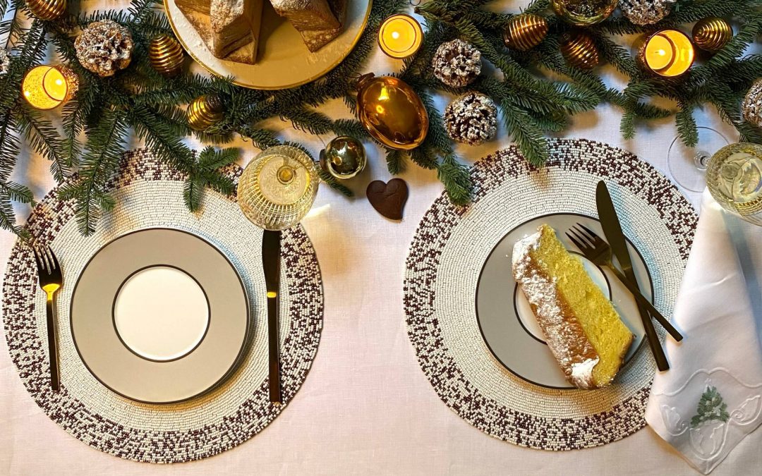
Winter White


To up the elegance we love the Lacquer Shell Placemat, with Pearl Napkin Rings for additional texture. (Looking for a warmer palette? Try the Splatter Placemat in bronze, as seen here).
If you’ve got fine china, go for it, but with these glam accents, even the most basic white plates will look celebration ready. For your centerpiece, lay a base of winter branches (foraged or bought, fake or real—no judgment here!). Then, add in a handful of white flowers (remember, you can always buy an inexpensive bouquet at your grocery store!) and accent with clear glass ornaments.
Who said white was boring?